ReacHire Rebrand
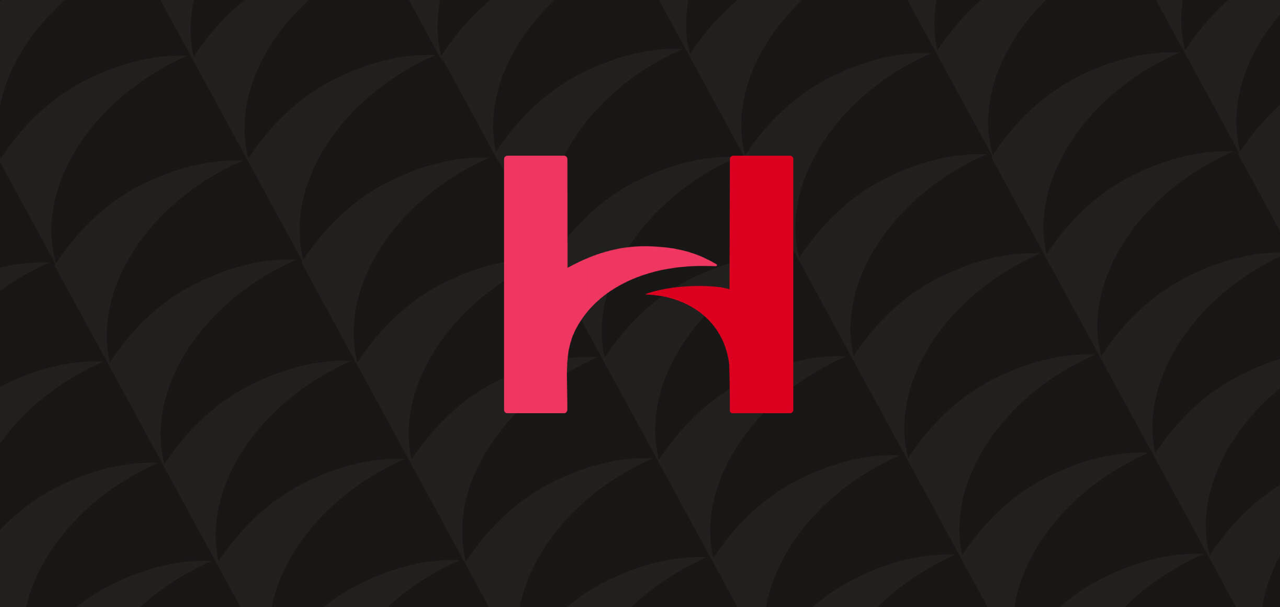
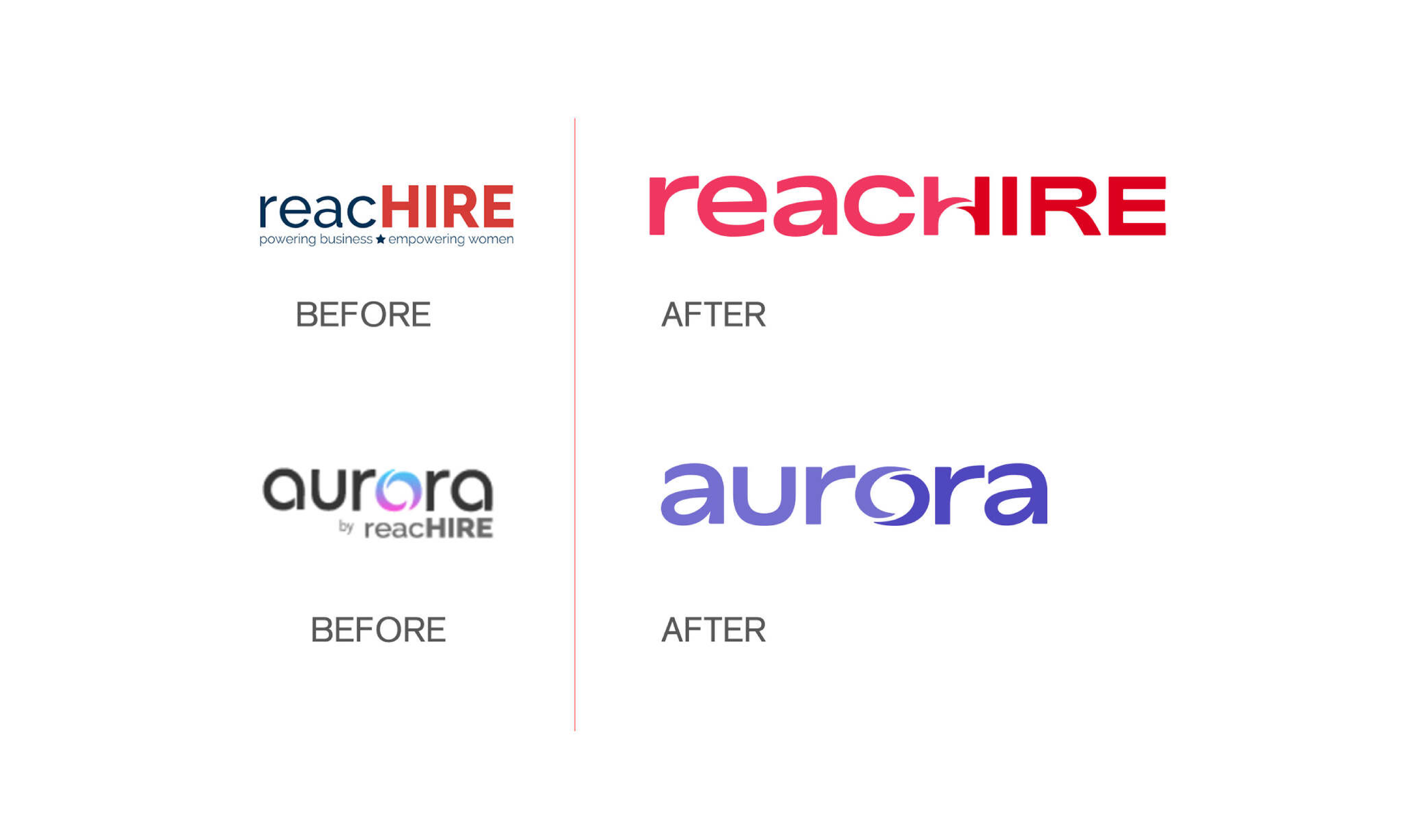
Helping women reach higher in their careers through a rehiring process; Reachire aims to connect women to business. The problem here was that "connection" was not being recognized within the branding. Disconnect in the master logo between the "c H" characters were causing legibility issues and disconnect between the master brand and sub-brand were causing identity issues. So, we built a bridge and got over it. The bridge was drawn using similar forms to the original sub-brand logo which helped ease the brand into an evolved place that felt more connected and succinct. Using the H as the bridge allowed us to connect reach and hire in a way that no longer disrupted legibility. The H icon on it's own also worked as a great rH monogram that we animated in the motion of literally "raising up" or "reaching higher". I'll never forget when Addie Shwartz, the CEO, told me I was "brilliant for this". Thanks Addie.