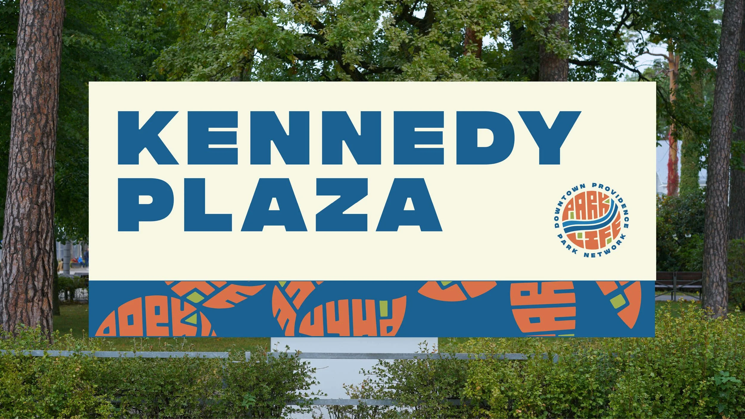
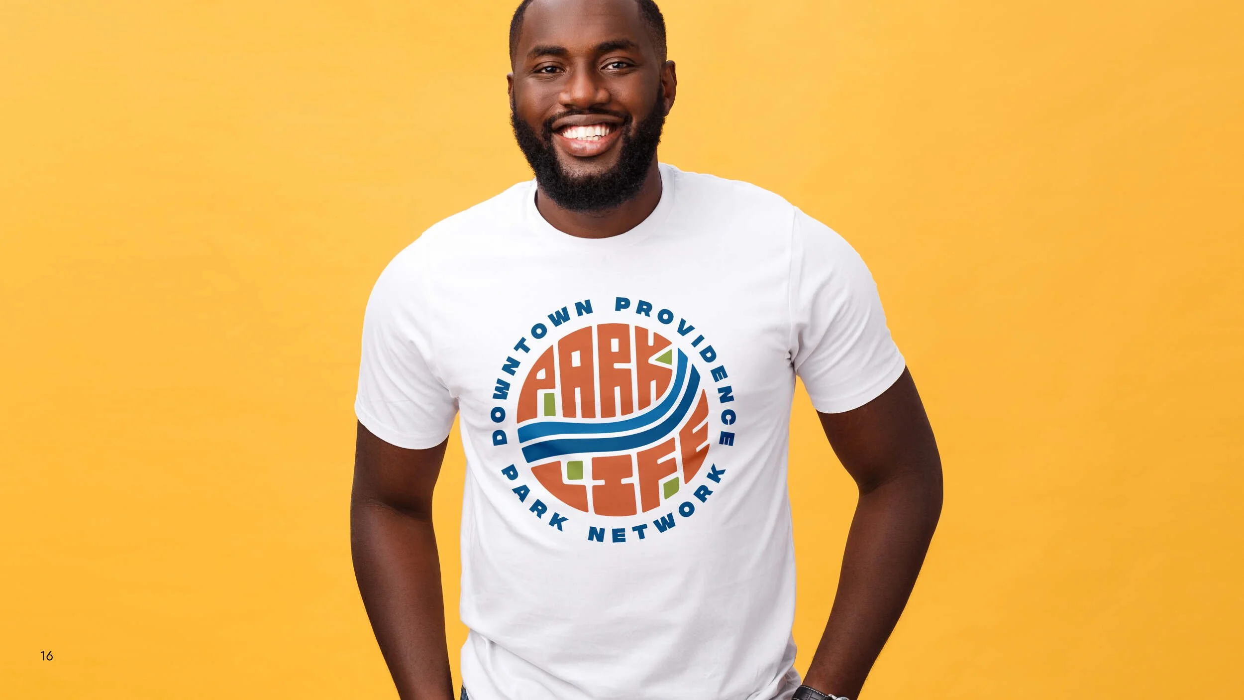
Park Life Brand Identity
The Downtown Providence Park Network was created by The City of Providence, The Providence Foundation, The Providence Parks Department, and I-195 Redevelopment District to cultivate enduring connection, pride, and vibrancy throughout the city parks.
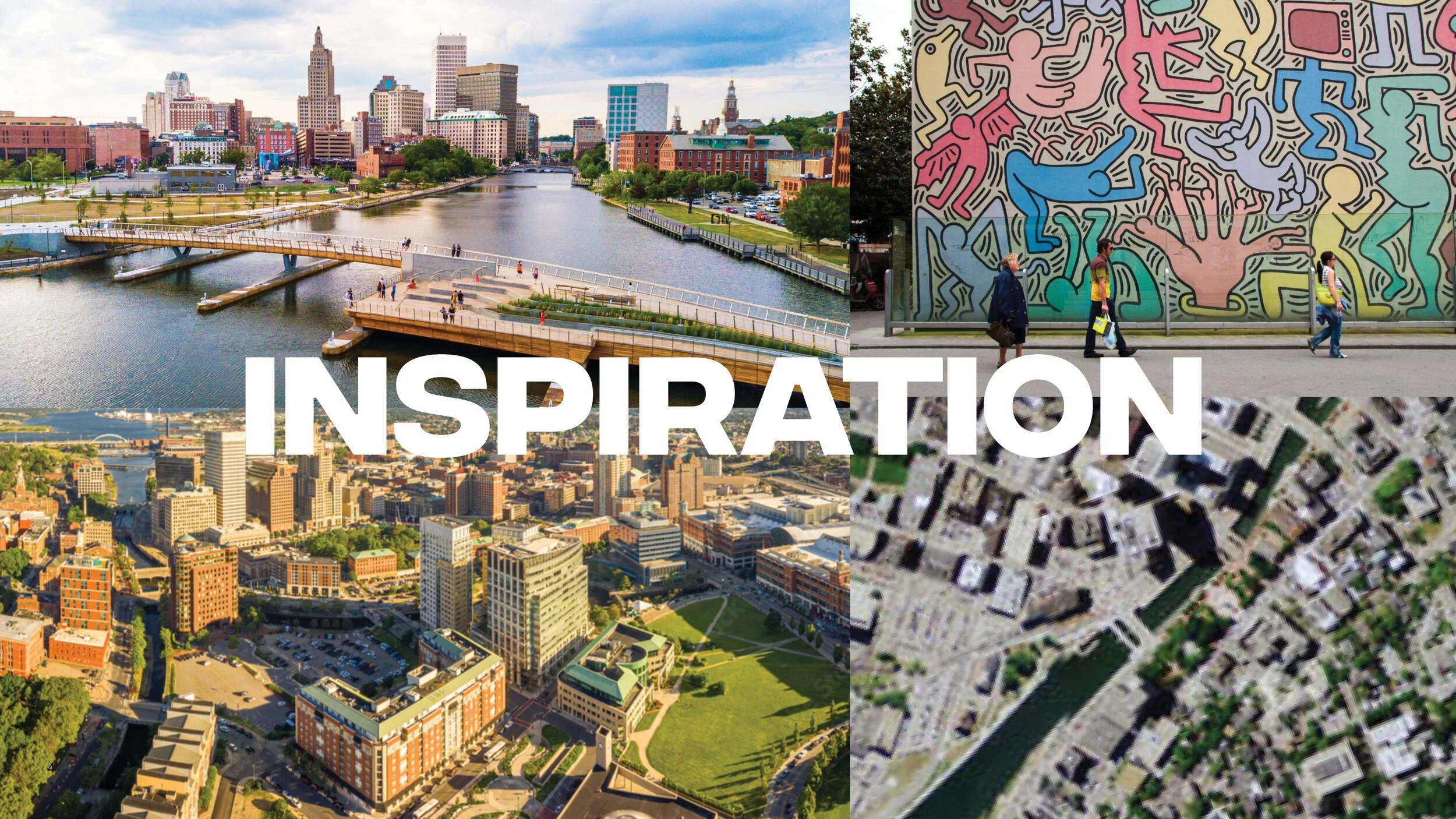
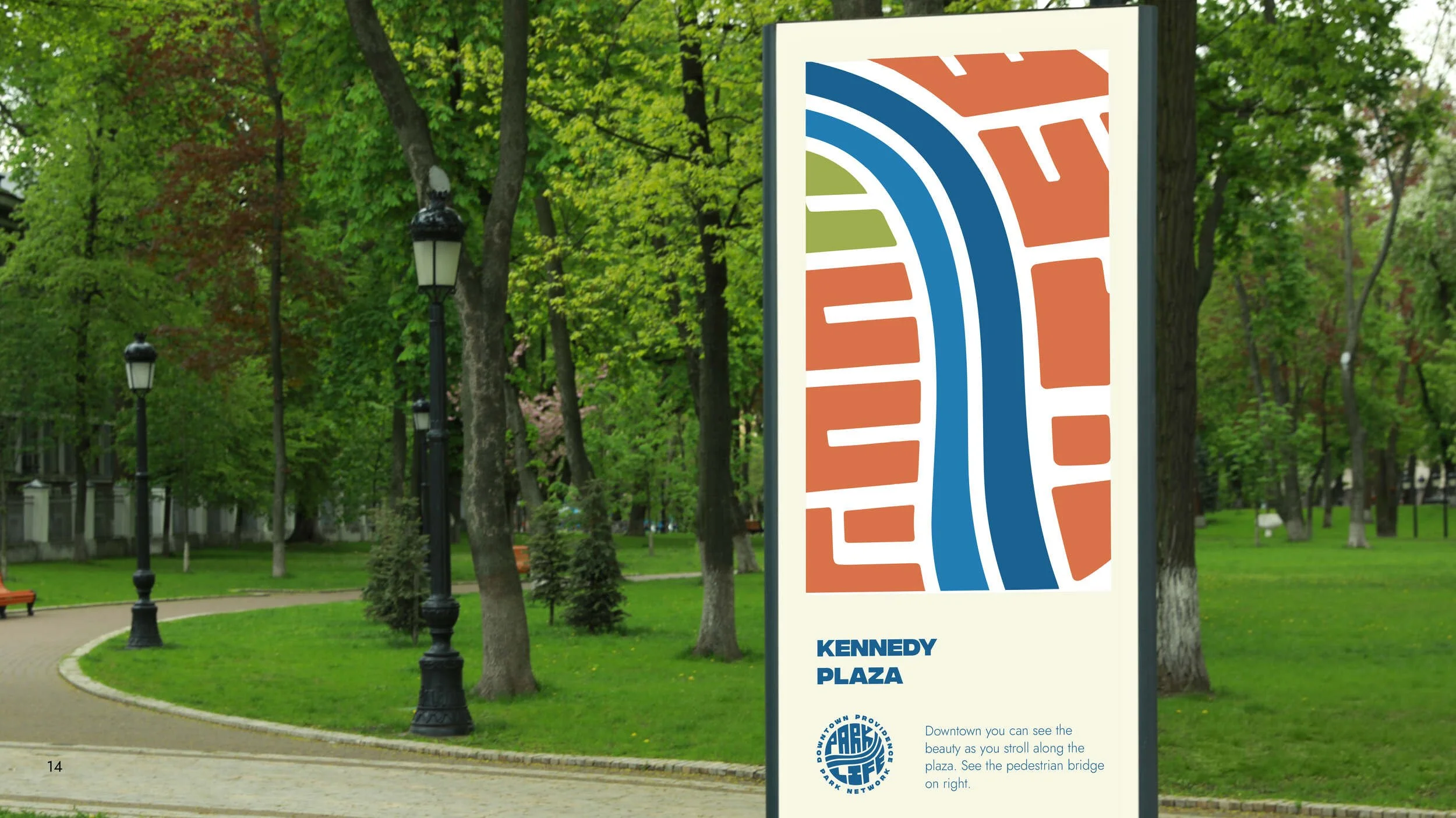
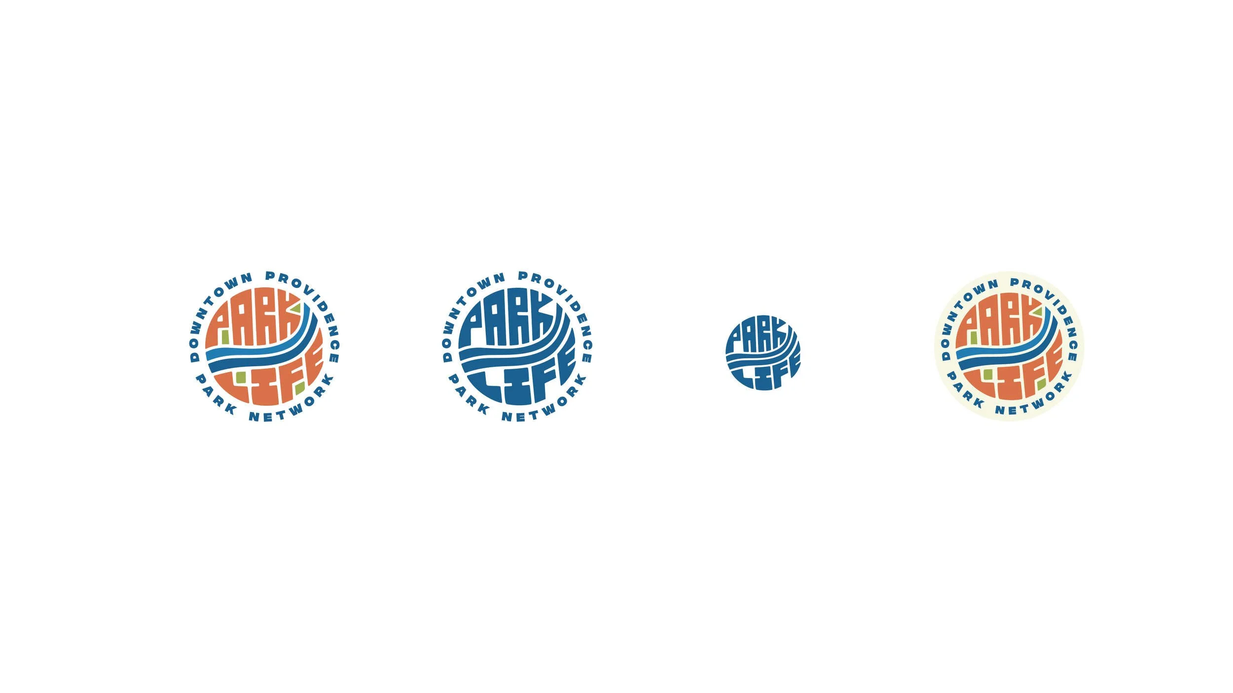
Branding this group was a ton fun! Pulling inspiration from urban art styles to capture a birds eye view of the river way lead to this awesome handmade seal logo that also acts as a mapping device.
In the logo Park Life is spelled out in abstract letter forms that emulate brick buildings, while the the negative spaces are green to act as representation of the parks, and lastly the providence river separates the two words or the "two sides of the city".
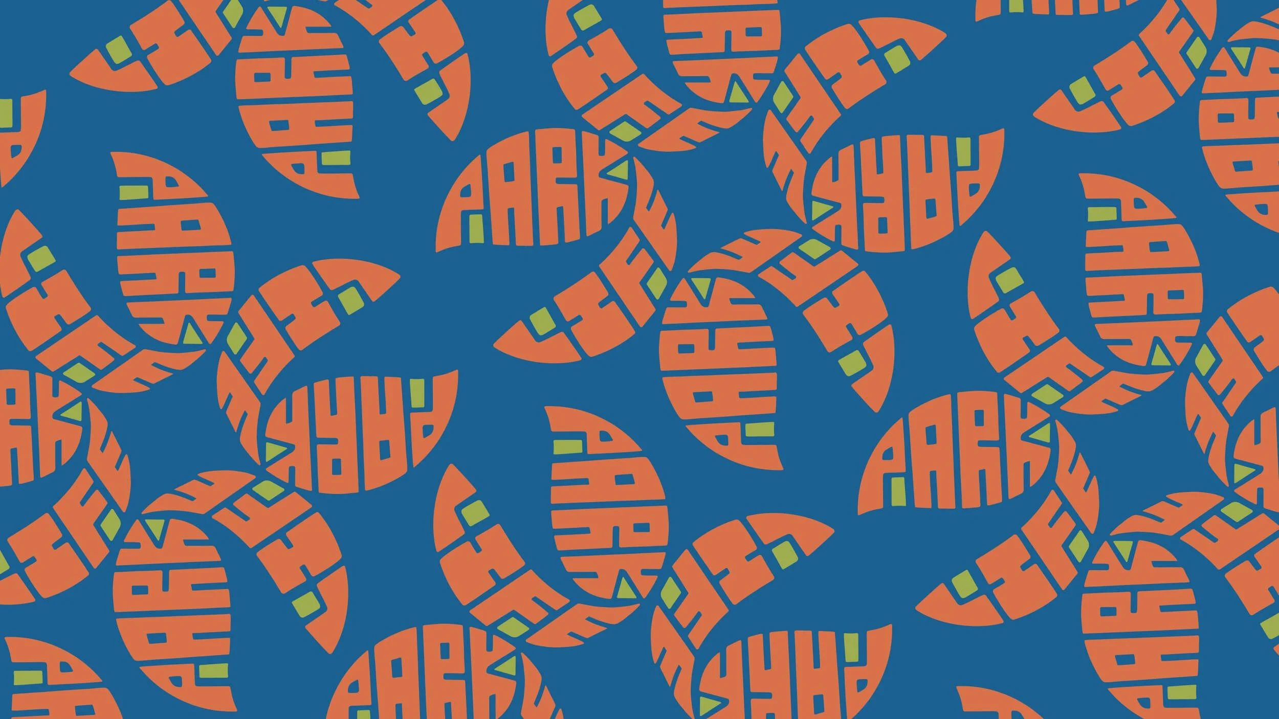
Further exploration of the brand mark lead to floral patterns representing some of the foliage found in the city parks. The abstract nature of the design captures a nice urban feel, bringing the vibrancy of our city to life.