Onward We Learn Rebrand and Naming
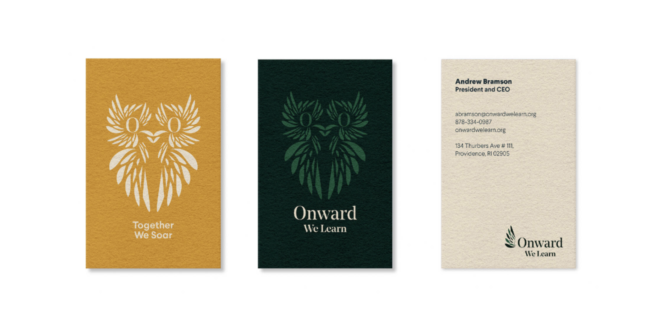
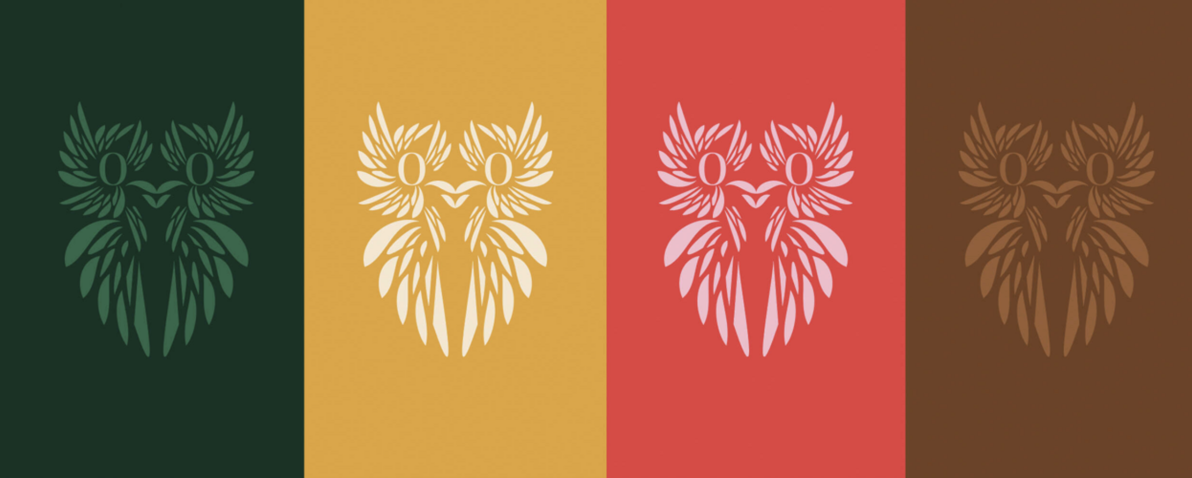
Onward We Learn reflects a bold step forward for an organization dedicated to guiding students through an ever-evolving educational journey. As the path to college and postsecondary success continues to change, the new name speaks to progress, resilience, and lifelong learning. The visual identity reinforces this momentum—featuring a wing in flight anchored to the “O,” a vibrant yet refined color palette that celebrates the energy and diversity of higher education, and the contemporary serif typeface Noe, which balances modernity with academic tradition. Together, the name and design signal growth, empowerment, and a future full of possibility.