
Nowell Academy Rebrand
This identity project was an inspiration. It was an honor to work with the good people at Nowell Academy. This school is dedicated to making the world a better better place by investing in WOMEN. Young mothers who would have otherwise dropped out of high school have a place to learn and set themselves and their children up for future success. Creating something beautiful for this brand was easy.
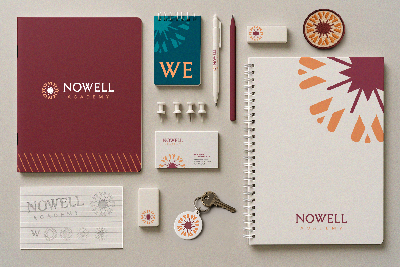
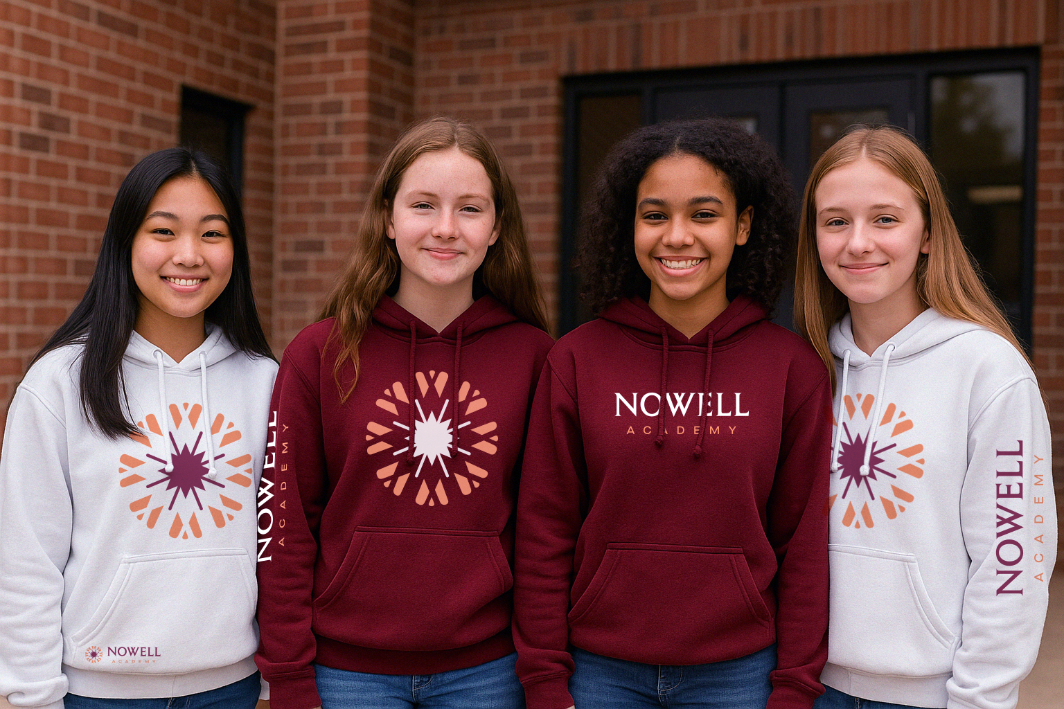
The mark was inspired by potential - I wanted to capture femininity, growth, and togetherness - so a flower in bloom seemed appropriate. The W in Nowell was used to draw the flower connecting it closer to the word mark and conceptually tying it closer to togetherness.