Nail Brand Refresh
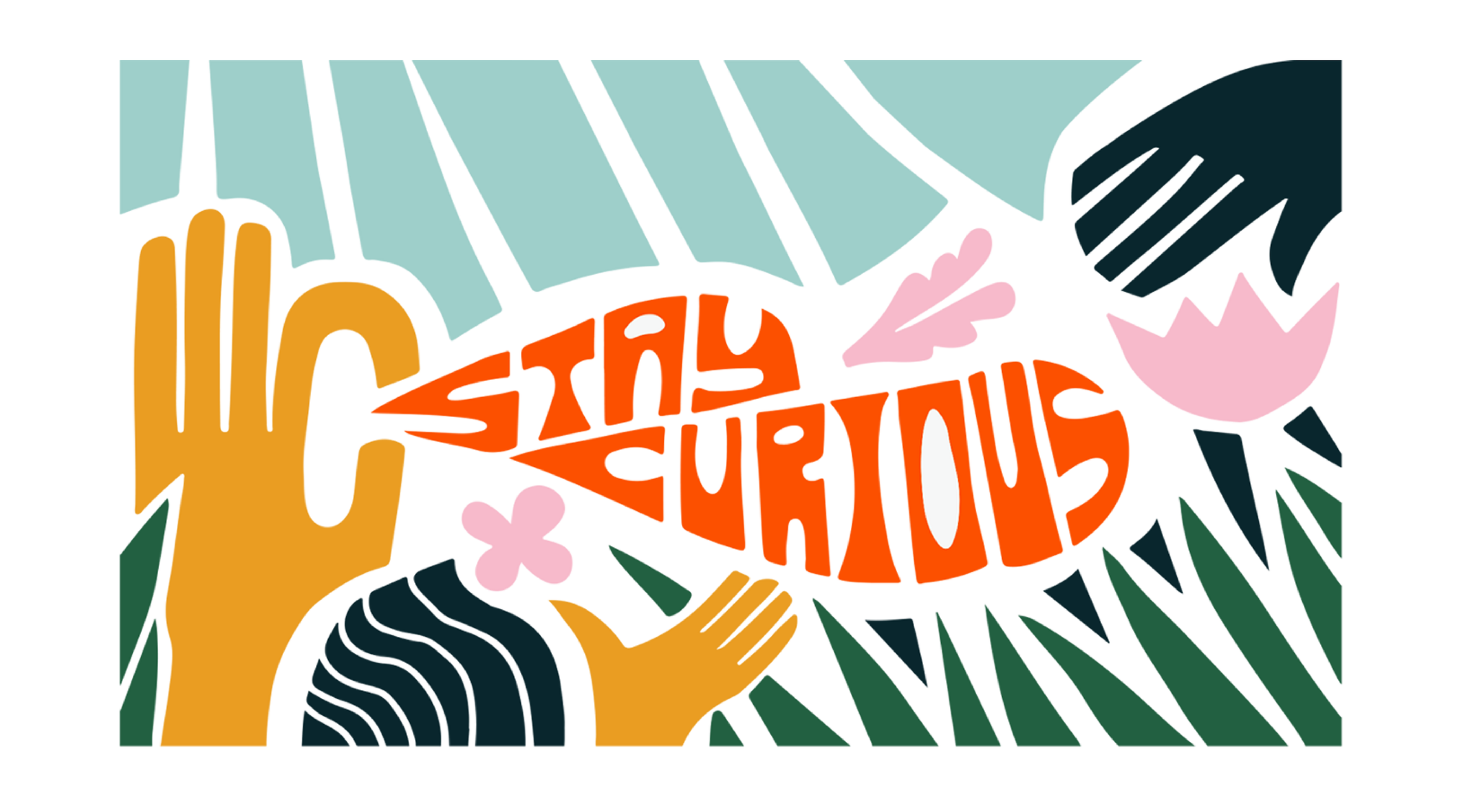
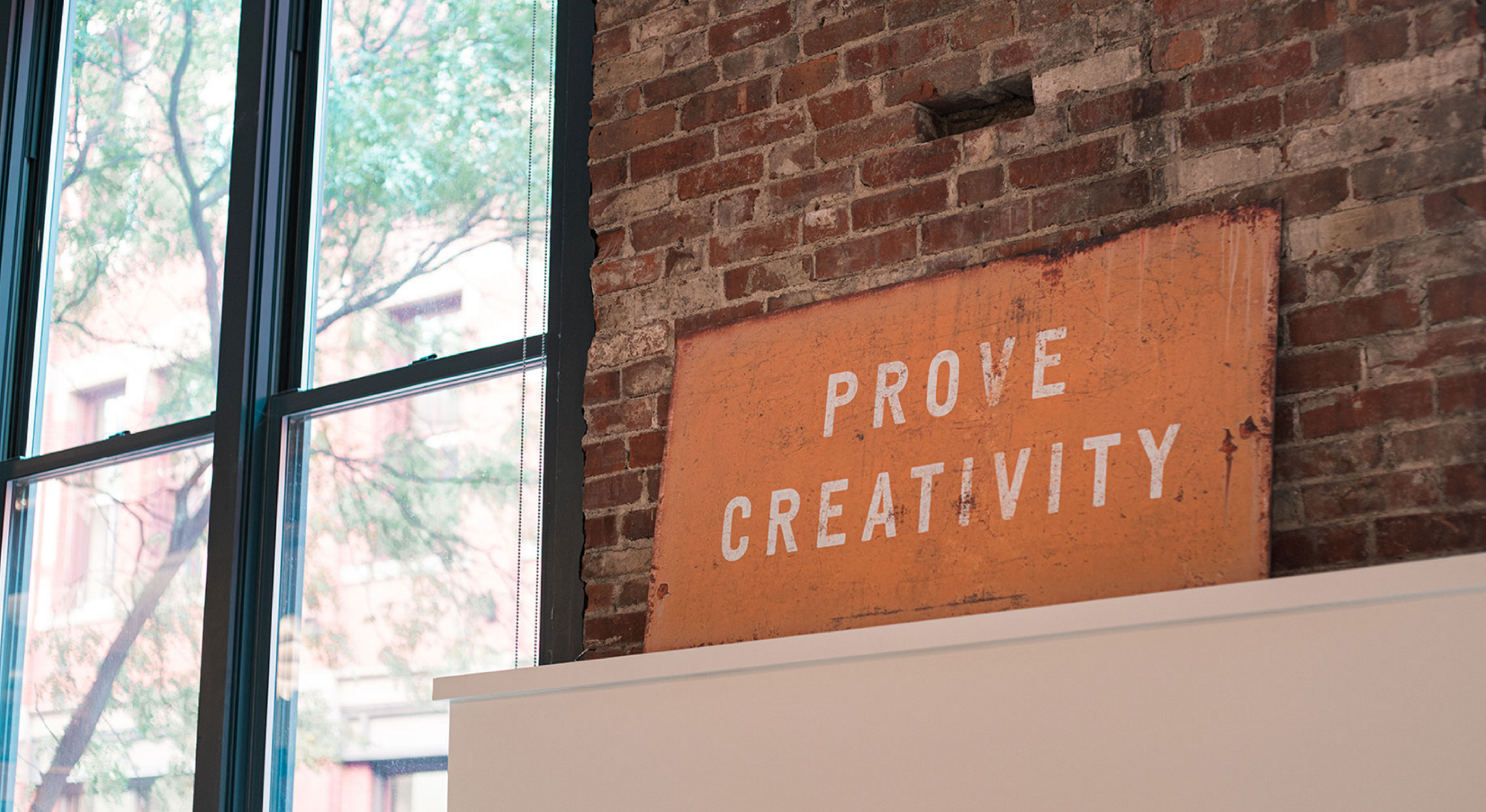
Over the pandemic Nail went though a series of changes that we felt needed to be more reflected in the branding. Going though equity training, starting our own DEI initiatives and internal restructuring pushed our agency to embrace a more welcoming and inclusive tone. By adding an expansive color pallet, taking the logo from all caps to lower case, and developing a flexible illustration set to reflect this in the brand while still maintaining some of the edge that makes nail, nail, I created this new system to act as a jumping board for endless creative explorations under that inclusive tone. The best part about this rebrand was getting to watch it come to life in real time. The interior design aspect of the project was a ton of fun!


