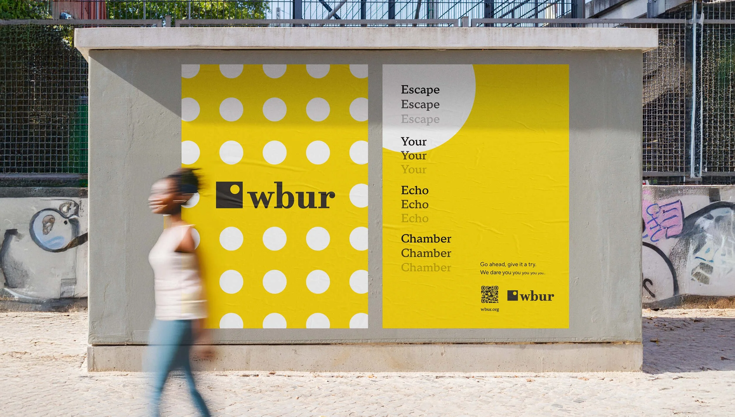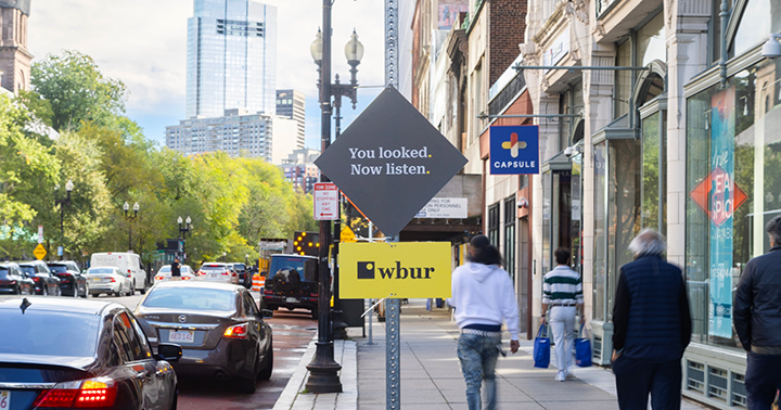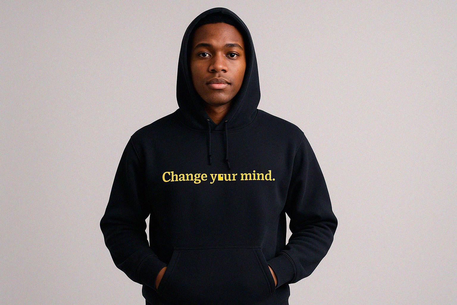

There’s outrage and algorithms. And there’s WBUR.
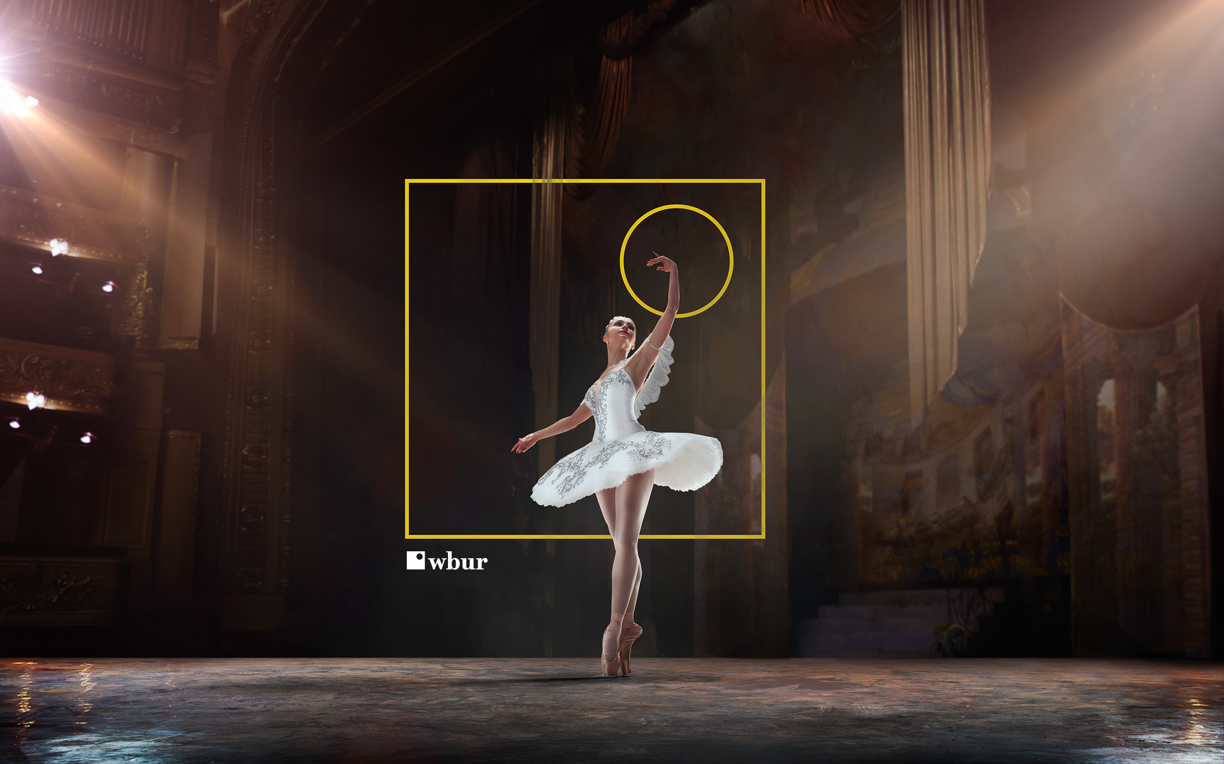
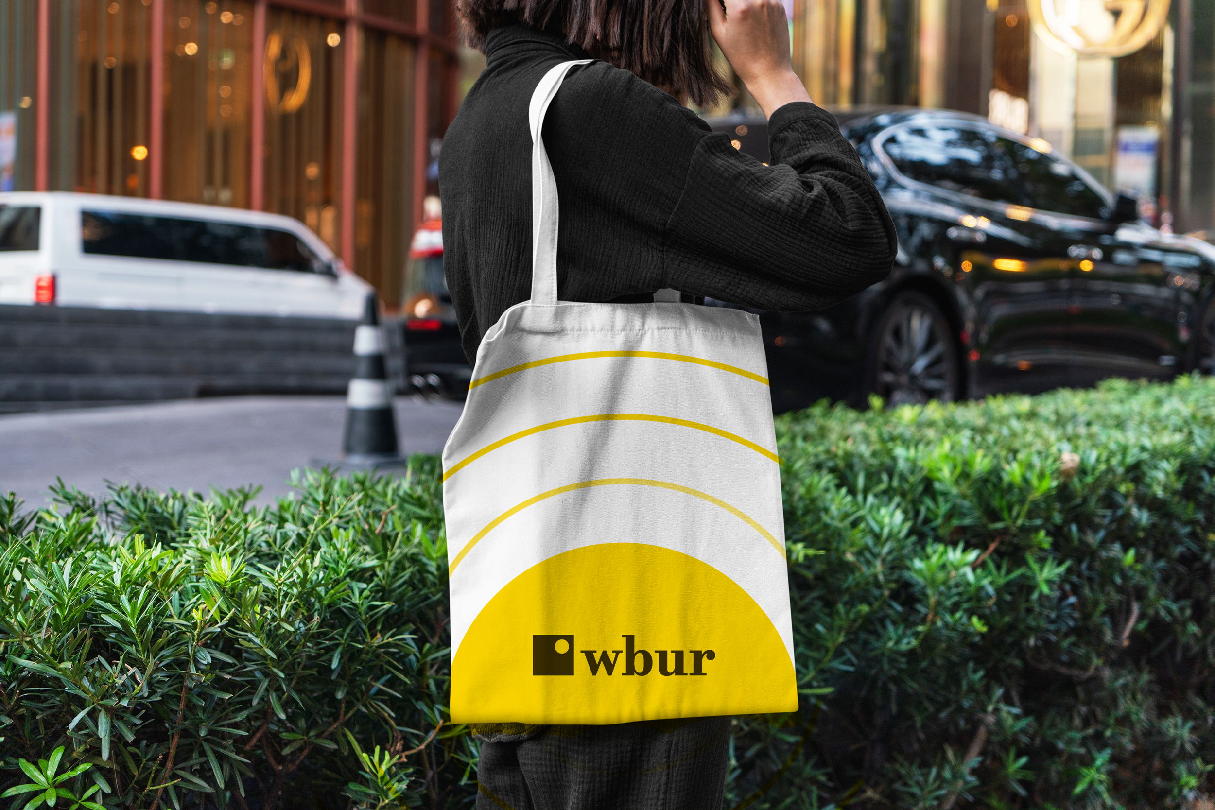
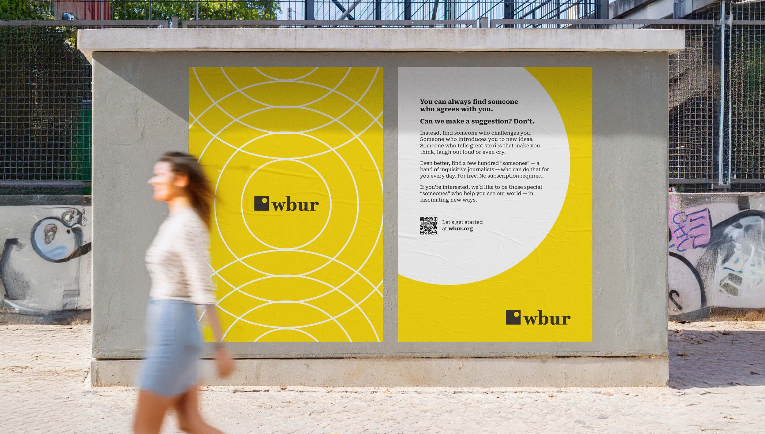
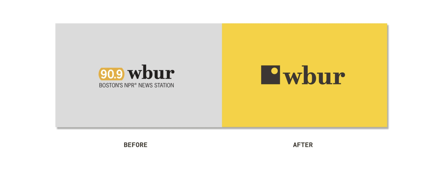
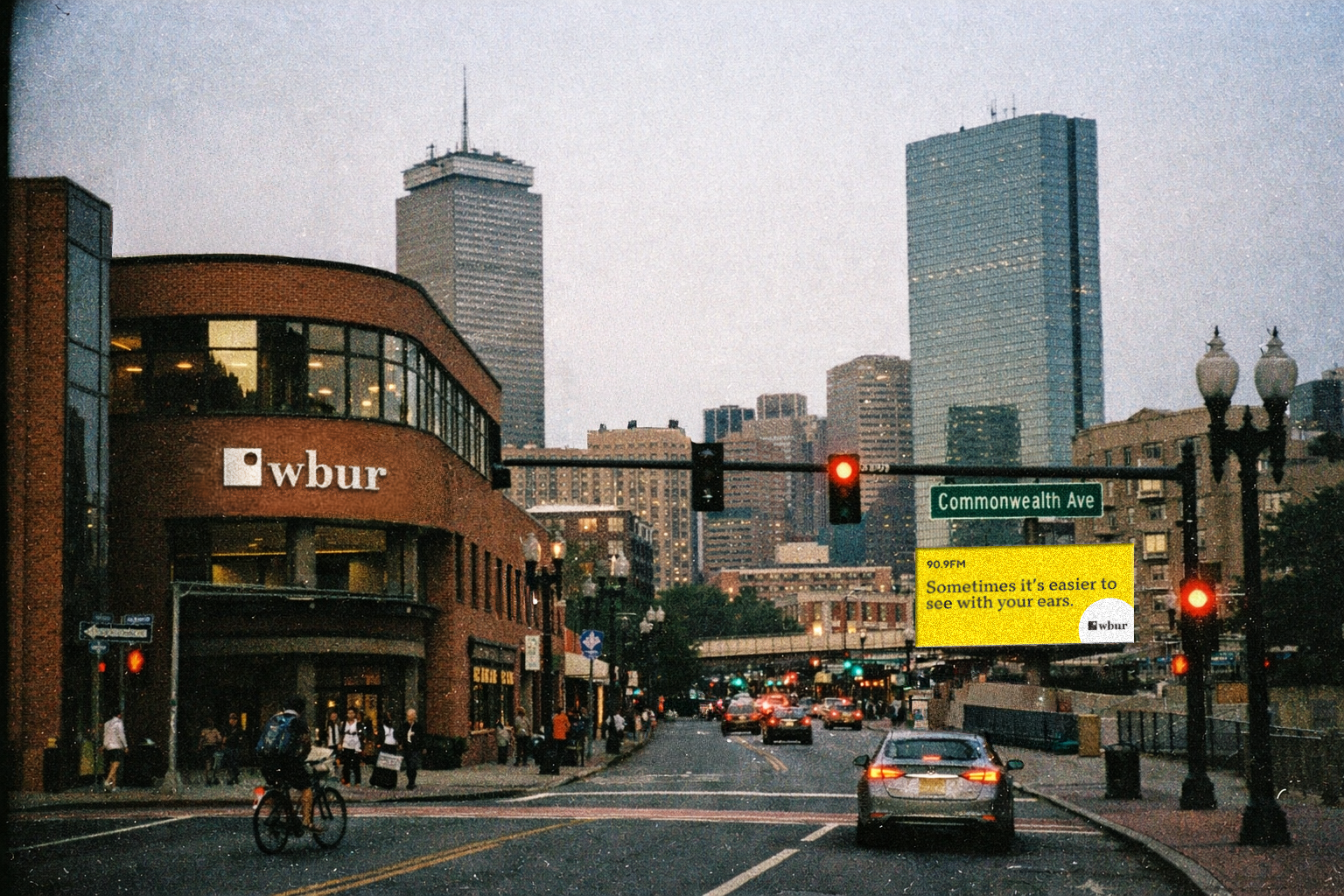
The WBUR rebrand project reimagines the organization’s visual identity to better reflect its role as a trusted, modern public media institution. The updated brand system is designed to be more flexible, accessible, and recognizable across digital, broadcast, and physical platforms, while strengthening consistency and clarity in how WBUR presents itself to its audiences. At the core of this system, the square and circle serve as foundational design elements that balance structure and humanity—the square representing stability, reliability, and the rigor of journalism, and the circle conveying openness, curiosity, and connection. When combined, the square with the circular cutout acts as a lens to the world, framing stories, perspectives, and voices, while also bringing improved visual balance to the wordmark through its refined geometry, weight, and proportions. Together, these elements create a cohesive, flexible relationship between symbol and type that enhances legibility, clarity, and overall brand presence across platforms.